Lytmus is an AI-mentored learning app for NEET aspirants, with video courses, doubt support, practice, and study planning. I took on their onboarding flow as an independent design project, rethinking how a student's first few minutes in the app could feel. Most onboarding just walks people through features. I wanted to see what it would look like if it gave the student real value instead.
Role
UI/UX Designer
Platform
Mobile app · AI-mentored learning
Focus
Onboarding flow · Conversational input · AI mentor interaction
Type
Self-initiated concept
PROBLEM
The first screen shouldn't ask a student to choose. It should help them start.
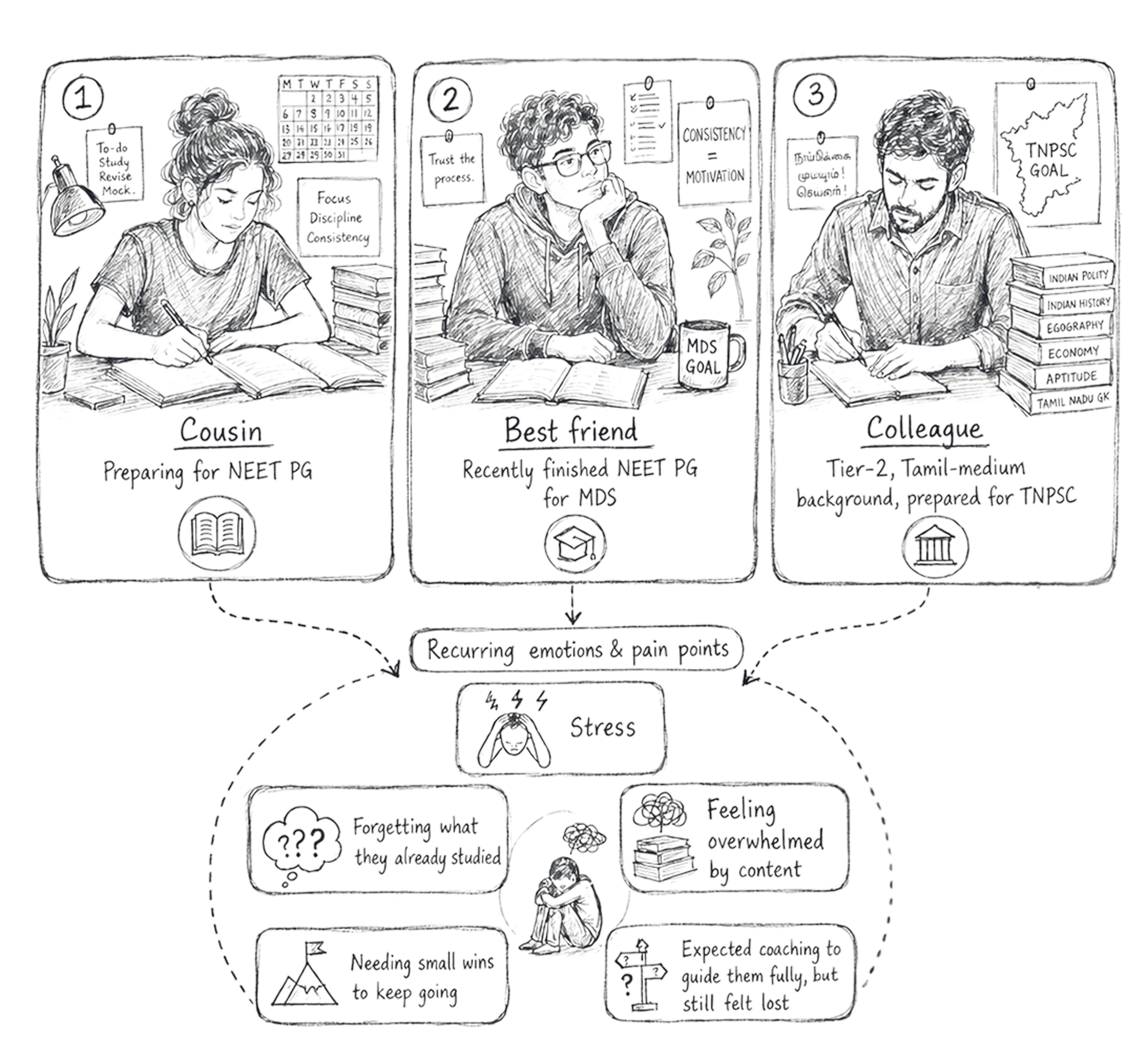
Students coming into Lytmus are already stressed and unsure about where they stand. Showing them a full app with lots of options on day one just adds another decision to make. Before they trust a learning app, they need to feel understood, not judged for being confused or behind. They need a starting point before they need choices.
RESEARCH

SOLUTION
The best onboarding doesn't explain the product. It proves it.
I added a short onboarding step before the homepage, but I didn't want it to work like most onboarding does. Most flows walk you through features, screen by screen, then leave you to figure out the rest. A student opening a learning app for the first time doesn't need a tour, they need something useful in their hands fast.
So instead of showing what the app could do, onboarding gives them something real. The AI mentor gets to know the student first, through a few simple inputs: what feels hard, their mock score, how much time they have, and how they want to be guided. From that, it builds a real 7-day starter plan before they even see the full app.
That's where trust actually starts. Not judged. Understood. A plan handed to them, not a dashboard full of features.
SOLUTION
The best onboarding doesn't explain the product. It proves it.
I added a short onboarding step before the homepage, but I didn't want it to work like most onboarding does. Most flows walk you through features, screen by screen, then leave you to figure out the rest. A student opening a learning app for the first time doesn't need a tour, they need something useful in their hands fast.
So instead of showing what the app could do, onboarding gives them something real. The AI mentor gets to know the student first, through a few simple inputs: what feels hard, their mock score, how much time they have, and how they want to be guided. From that, it builds a real 7-day starter plan before they even see the full app.
That's where trust actually starts. Not judged. Understood. A plan handed to them, not a dashboard full of features.
key ux Decisions
Breaking the workflow into steps
The redesign focused on clarity and scalability, ensuring a smooth user journey and a cohesive digital identity.
It made a messy process easier to follow. Students didn't feel lost. Designers and manufacturers still had every setting they needed, just organized instead of dumped on one screen.
Defaults you can question, not follow blindly
Every field starts with a sensible default. So a student who doesn't know what value to enter yet can still run something and learn from what happens.
Nothing is locked. Anyone can change any default. It's just there so you're not staring at a blank field wondering what to type.
Sample vehicles instead of an empty screen
New users get real sample vehicles they can open, mess with, and rerun. It's a faster way to learn than reading instructions — you see how a change to one input moves the output.
Manufacturers use the same samples to check if the tool's logic makes sense before they trust it with their own numbers.
Logs that actually show what's happening
In most software, logs are something only developers look at. Here, they're for everyone. Solver progress, warnings, errors — all visible, not buried.
This matters more for manufacturers than it sounds. If a simulation is going to inform something they'll actually build, they need to see what the tool is doing, not just wait for an answer.
Results you can act on, not just read
A result on its own isn't that useful. So I built the results screen around what people do next: export it, generate a report, change something and rerun, or dig into what went wrong.
A manufacturer exports and moves on. A student reruns to see what changes. Same screen, different use.


impact
Less input overwhelm
Setup felt easier to follow. Beta users found the simulation setup clearer after dense motor parameters were split into guided stages.
10%
10%
Faster first simulation
Blank-start friction reduced. Sample vehicles and default values helped new users reach their first simulation run faster. stages
0 x
0 x
Input doubts
Inline parameter guidance. Info buttons reduced student confusion by explaining each parameter directly at the point of input.
<0%
<0%
Note - Metrics are based on beta customer feedback, internal prototype walkthroughs, and usability observations. They are usability indicators, not post-launch analytics.

REFLECTION
Aerolink’s previous platform was difficult to navigate and didn’t effectively communicate the brand’s innovative value.
The redesign focused on clarity and scalability, ensuring a smooth user journey and a cohesive digital identity.
Pi-CADS also pushed me to work closely with engineers - sitting with terms I didn't know, asking what they actually meant, and figuring out how to turn that dense product logic into a workflow someone could actually move through, step by step.